Mastercopy, 2009
Lars Breuer, Sebastian Freytag, Guido Münch
Wilhelm-Hack Museum, Ludwigshafen
21 x 24,5 cm
Kerber Verlag, Bielefeld
-
Interview Reinhard Spieler dt.
„Kalte, gnadenlose Ernsthaftigkeit!”
Ein Gespräch mit Lars Breuer, Sebastian Freytag und Guido Münch
RS: Anfang des 20. Jahrhunderts gab es den „Blauen Reiter”, „Die Brücke”, die Fauves, später die Futuristen und die Vortizisten; die Zeit der Künstlergruppen scheint aber eher vorbei zu sein. Warum seid ihr als Gruppe zusammen?
Lars Breuer: Das war nicht geplant, es hat sich so ergeben. Wir haben uns im Studium kennengelernt und mussten feststellen, dass wir gemeinsame Interessen haben. Das hat zur Gründung eines Ausstellungsraums geführt, den wir auch heute noch betreiben. Einen vorhergehenden Ausstellungsraum haben wir mit einer gemeinsamen Ausstellung beendet. Die Erkenntnis, die wir aus dieser Ausstellung gezogen haben, war die, dass unsere künstlerischen Interessen eine adäquate Umsetzung vor allem in der gemeinsamen Installation finden, dadurch, dass wir formal und inhaltlich aufeinander reagieren und Kontraste und auch Widersprüche bilden können.
RS: Gibt es für eure gemeinsame Kunst auch eine theoretische Basis, die euch verbindet, etwa gemeinsame Programme oder Manifeste?
Sebastian Freytag: Unsere Interessen sind gar nicht so homogen, auch wenn die Bilder und Ausstellungen vielleicht einheitlich aussehen. Was uns verbindet, ist die Heterogenität der Materialien, der Vorbilder, also der Kontrastreichtum. Es gibt kein gemeinsames Weltbild, keine Utopie, die uns vereint und zu einem Manifest führt. Die Einfl üsse stehen immer in einem Spannungsfeld. Wir setzen nicht auf die reine Abstraktion, den reinen Klassizismus oder die reine Romantik, sondern was uns reizt, ist der Spannungsreichtum, das Aufeinanderprallen der verschiedenen Elemente.
Lars Breuer: Wir haben versucht, einen gemeinsamen Text zu schreiben, Vorträge zu halten, sind aber an einem einheitlichen Text gescheitert. Am Ende hat jeder seinen eigenen Text einzeln vorgetragen. Der eine hat sich für einen wissenschaftlichen Sprachstil entschieden, der andere mit Zitaten gearbeitet oder einen freien Text, pamphletartig, vorgetragen, Guido hat Musik von CDs abgespielt – das ergab zwar immer ein kohärentes Gesamtbild, ist aber trotzdem aus einzelnen Teilen zusammengesetzt, genau wie unsere Ausstellungen.
RS: Gibt es denn einen kleinsten gemeinsamen thematischen oder stilistischen Nenner eures künstlerischen Ansatzes?
Guido Münch: Es gibt bestimmt diesen gemeinsamen Nenner, aber wir bemühen uns nicht darum, ihn zu formulieren. Was uns eher verbindet, ist die Ablehnung bestimmter Dinge.
RS: Was lehnt ihr ab?
Guido Münch: Vor allem eine falsche, verlogene Vorstellung von Kunst bezüglich Kreativität und Freiheit hat uns abgestoßen, diese Klischees: das Künstlerbild des kreativen, mittelständischen, einfallsreichen Künstlers.
Sebastian Freytag: Es gibt zurzeit offensichtlich zwei Tendenzen: die des subjektiven Selbstausdrucks, vor allem in der Malerei, die der Individualität, Genialität, der übersteigerten Selbsterfindung. Auf der anderen Seite gibt es die spielerischironische Konzeptkunst. In beiden Strängen, der ironischen Moderne und der naiv-romantischen Malerei, haben wir uns nicht wohlgefühlt. Wir haben dies als Fehlinterpretation des 20. Jahrhunderts empfunden. Das Erbe, das wir antreten wollen, ist weder dieser Romantik noch der ironischen Konzeptkunst verpflichtet.
RS: Wie sieht euer Gegenmodell aus?
Lars Breuer: Ernsthaftigkeit. Kalte, gnadenlose Ernsthaftigkeit! Dafür sollen unsere Arbeiten stehen.
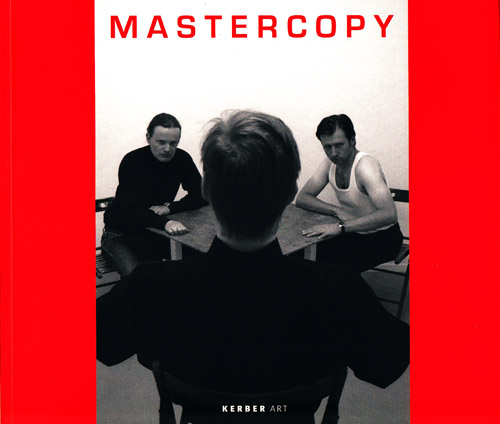
Guido Münch: Deshalb haben wir z. B. auch das Foto von uns als Titelbild für die Ausstellung gewählt (siehe Buchcover).
RS: Ist diese Ernsthaftigkeit, mit der ihr da auftretet, nicht auch als ironische Brechung zu verstehen?
Sebastian Freytag: Nein. Wir haben die Vorlage eins zu eins nachgestellt und kommentieren diese auch nicht. Wir bleiben in der gleichen Pose, bleiben nah am Vorbild und versuchen, die Abweichung gering zu halten.
RS: Aber eine gewisse ‚Coolness’ scheint ja doch intendiert zu sein, was die Ernsthaftigkeit als Pose entlarvt.
Lars Breuer: Bei den Künstlern, die wir bewundern, etwa Ad Reinhardt oder Jackson Pollock, findet man diese Selbstdarstellung ja auch.
Guido Münch: Diese Grundatmosphäre interessiert uns, die Entschlossenheit dieser Leute begeistert uns. In der Kunst geht es um alles! Unter diesem Level kann man Kunst nicht betreiben.
RS: Noch einmal zum Verhältnis von Gruppe und Individuum. Wie wichtig ist es euch, als Einzelkünstler identifi zierbar zu sein?
Lars Breuer: Am besten kann man es mit einer Band vergleichen. In der Popmusik gibt es auch Solokarrieren und Soloprojekte. Aber im Zusammenklang entsteht eben ein spezifischer Sound. Wir schreiben zwar die Namen des einzelnen Künstlers nicht unter jedes Bild, aber es ist schon zu trennen. Wir haben aber nie beschlossen, keine Soloprojekte zu machen. Jeder stellt auch allein aus. Die Geschlossenheit als Gruppe ist mehr eine Sicht von außen. Wir sind als Künstler autonom. Es gibt den Einzelkünstler, die KONSORTIUM-Gruppe, dann vielleicht noch Künstler, die mit uns gearbeitet haben, und dann die große Menge an Bezügen, die wir auch zur Schau stellen.
RS: Immerhin habt ihr euch den gemeinsamen Namen KONSORTIUM gegeben, der euch als Gruppe sichtbar macht.
Lars Breuer: Der Name bezog sich ursprünglich nur auf unseren Ausstellungsraum, erst später hat man das auch auf uns als Künstlergruppe übertragen.
RS: Um es noch einmal auf den Punkt zu bringen: Die radikale Ernsthaftigkeit in der Kunst verbindet euch als Gruppe?
Sebastian Freytag: Ja. Und das Bemühen, mit der Vergangenheit der Kunst umzugehen, ohne die Dinge zu konterkarieren, sondern sie in ihrer Form zu übernehmen und weiterwirken zu lassen. Das postmoderne Credo des ‚Anything goes’ reizt uns und wir wollen nicht davor zurückschrecken. Wir wollen uns der Herausforderung des Avantgarde- und Manifest- Verbots stellen und die Dinge trotzdem machen.
RS: Hat diese Radikalität des Zugriffs auf die Kunst auch etwas mit dem Kunstmarkt zu tun, damit, dass man sich dem Markt gegenüber in einer bestimmten Weise verhalten muss?
Sebastian Freytag: Ich war und bin total schockiert, dass es in der Kunst überhaupt um Geld gehen könnte und das Gespräch immer darauf kommt.
RS: In eurem Ausstellungsraum haltet ihr euch da bewusst aus allen kommerziellen Interessen heraus?
Guido Münch: Absolut. Dorthin laden wir Leute ein, die wir interessant finden und deren Arbeit wir schätzen. Der Raum ist von Freiheit getragen, nicht von Geld. Wir bieten den Kollegen die Bedingungen, die wir selbst gerne haben.
Sebastian Freytag: Um Ökonomie geht es ja nie primär. Vorrangig fordern wir Hochachtung und die lässt sich auch nicht allein in Geld ausdrücken. Das Moment der Wertschätzung ist uns wichtig.
RS: Kann sich Hochachtung nicht auch im Preis ausdrücken?
Sebastian Freytag: Wenn jemand erkennt, dass ein Werk unbezahlbar ist, dann bin ich auch bereit, es zu verschenken.
Guido Münch: Die Wände mit Kopien der Buchcover, die wir für die Rudolf-Scharpf-Galerie gemacht haben, sind ja nicht nur intellektuelles ‚Posing’, sondern vor allem der Rahmen unseres Diskurses: die Energie, die uns weitertreibt – die unauflöslichen Widersprüche dieser Weltbilder.
RS: Ist euer utopischer Anspruch nicht ein Widerspruch zu eurer Abwehr gegen das romantische Künstlerbild, auch ein Widerspruch zu eurer unpersönlichen Bildsprache?
Guido Münch: Da kommen wir vielleicht auf einen richtigen Begriff von Kunst, nämlich dass künstlerische Vorstellungen nicht verhandelbar sind. Diese sind Repräsentanten idealer Ideen, um die es in der Kunst gehen muss. Wenn man das für romantisch hält, ist es in Ordnung. Das ist keine romantische Gartenzwergperspektive, sondern eine Caspar-David-Friedrich- Perspektive, der Landschaften als Seelenlandschaften gemalt hat.
RS: Würdet ihr eure Bilder als romantische Seelenlandschaften definieren? Sie bieten im Gegensatz zu Caspar David Friedrich wenig Ansatz zu emotionaler Entfaltung, sondern verweigern diese ja explizit.
Lars Breuer: Es sind keine Seelenbilder im expressionistischen Sinn. Es sind eher konstruierte Bilder. Verschiedene künstlerische Ideologien und Stränge treffen zusammen, um aktuelle Stimmungen und Energien zu erzeugen.
Sebastian Freytag: Man stelle sich einen Cyborg vor, der zwar mit all diesen kunsthistorischen und philosophischen Errungenschaften und gescheiterten Weltbildern gespeist wurde, aber dennoch für das Wort ‚Seele’ keine Verwendung hat. Was für eine Seelenlandschaft würde der malen …?
RS: Es fällt auf, dass eure Werke Emotionalität völlig verweigern. Darum funktioniert ihr vielleicht auch als Gruppe so gut, weil ihr so wenig Individuelles zeigt und so wenige persönliche Ausdrucksformen verwendet. Warum sucht ihr solche unpersönlichen Ausdrucksformen?
Guido Münch: Um den emotionalen Inhalt zu neutralisieren. Man braucht diese objektive Form, um überhaupt etwas verständlich zu machen. Man darf nicht in das konventionelle Denkschema verfallen, dass eine bestimmte Form für eine bestimmte Emotion steht.
Sebastian Freytag: Für mich bedeutet Kunst eine Abkehr und Enthobenheit vom Leben. Als Resultat sehe ich meine Kunst als übergeordneten Teil einer Idealwelt.
RS: Also ist Kasimir Malewitsch als Vater einer ikonenhaft entindividualisierten Kunst einer eurer ‚Götter’?
Lars Breuer: Wir können keine einzelne Person hervorheben, sondern eher eine Auflistung erstellen. So wie die Strenge der Form den emotionalen Inhalt neutralisiert, verhindert die Vielzahl der Einflüsse die Neutralisierung in kunsthistorische Harmlosigkeit. Unsere Kunst soll wie ein Virus sein, der sich ständig verändert.
RS: Ist das nicht eine etwas naive Vorstellung? Die Wirkung der Kunst lässt sich kaum kontrollieren. Jede Kunst hat das Potenzial zu infizieren. Vincent van Goghs Kunst erreicht Milliarden von Menschen ‚nur’ auf Kalenderniveau. Es gibt aber auch genug Menschen, die von einem seiner Bilder ganz persönlich berührt werden, während andere es gedankenlos konsumieren.
Guido Münch: Dieses Maß an Kontrolle verfolgen wir ja nur, um die Rezeption in bestimmte Kanäle zu lenken, Zusammenhänge, von denen wir annehmen, dass sie wirksam werden könnten.
RS: Euer Ausstellungsraum befindet sich in einem Düsseldorfer Hinterhof. Würde eure Kunst auch funktionieren, wenn euer Raum beispielsweise ins MoMA transferiert werden würde?
Sebastian Freytag: Wir sind ja in Düsseldorf auch mehrfach eingeladen worden, auf großen Ausstellungsflächen auszustellen. Wir hatten schon den Eindruck, dass wir die Formate im Griff haben.
RS: Es geht ja auch nicht so sehr um die Fläche als um die Aufmerksamkeit, die euch zuteilwürde. Hier ist es der Hinterhof, eine kleine, eingeschworene Gemeinde, wo ihr der Geheimtipp seid, im MoMA wäret ihr das Topereignis.
Lars Breuer: Das wäre dann ein anderer Dialog: in dem Fall mit der Sammlung des MoMA – ein Kommunizieren mit den Kunstwerken, auf die wir uns beziehen. Da wären unsere Werke
im richtigen Kontext.
Guido Münch: Wobei ich fi nde, dass das KONSORTIUM die gleiche Relevanz hat wie ein Museum. Die Kunst verändert sich nicht, auch wenn sie im MoMA ausgestellt wird. Kurt Cobain hat einmal gesagt, dass es am schwierigsten war, die ersten 80 Leute von seiner Band zu überzeugen. Das finde ich faszinierend, dass man sich erst im Underground behaupten muss. Wenn die erste Hürde nicht geschafft wird, scheitert die Kunst auch im großen Zusammenhang.
Das Gespräch fand am 24.7.2009 in Düsseldorf statt. -
Interview Reinhard Spieler engl.
“Cold, hard seriousness!”
A conversation with Lars Breuer, Sebastian Freytag and Guido Münch
RS: In the early Twentieth Century there were groups like “Der Blaue Reiter”, “Die Brücke”, the Fauves and later on the Futurists and Vorticists, but artists’ groups seem to be a thing of the past. What made you decide to form a group?
Lars Breuer: It wasn’t planned; it just kind of happened. We got to know each other while we were studying and realised that we had a lot of interests in common. So we ended up opening an exhibition space which we’re still running today. There was actually another space beforehand which closed with a group exhibition by us (see page 49–51). What we took on board from that exhibition was the idea that the best form of articulation for our artistic interests is collaborative installation because it allows us to react to the form and content of one another’s work, and that produces all kinds of contrasts and contradictions.
RS: Is there a theoretical basis for your collaborative approach, one that unites you, a common agenda, for example, or a manifesto?
Sebastian Freytag: Our interests aren’t all that homogeneous, even if the pictures and exhibitions might give that impression. What we have in common is more the heterogeneity of the materials, of the models – all the different contrasts, in other words. There’s no common world view, no shared utopia that might lead to a manifesto. The infl uences we have always exist in tension with one another. We’re not into pure abstraction, pure classicism or pure romanticism; what we fi nd captivating is more the tension between different elements or the way they collide with each other.
Lars Breuer: We’ve tried to write a text together, to give lectures, but we couldn’t come up with a coherent text. In the end we all just had to deliver our own individual texts one after the other. One of us chose to write in a really academic style whereas another guy worked with quotations or delivered a piece of creative writing that read a bit like a political pamphlet, and Guido played music from CDs – it might have resulted in a coherent whole, but it was still comprised of all the different individual parts, just like our exhibitions.
RS: Is there a lowest common denominator in your artistic approach as far as theme or style is concerned?
Guido Münch: There’s defi nitely a common denominator, but we don’t set out to formulate it. What we have in common is more the rejection of certain things.
RS: What do you reject?
Guido Münch: Mainly the false, dishonest notion of art as far as creativity and freedom are concerned. All those clichés really turn us off – the image of the creative, middle-class, innovative artist.
Sebastian Freytag: At the moment, there seem to be two prevailing tendencies: that of subjective self-expression, primarily in painting, of individuality, genius and exaggerated self-invention. And on the other hand, there’s all this playfully ironic conceptual art. We didn’t feel comfortable with either of these approaches, with either ironic modernism or the naïve romanticism of painting. The way we see it, they’re both misinterpretations of the Twentieth Century. The legacy we want to draw on in our work has nothing to do with that kind of romanticism or ironic conceptual art.
RS: So how would you describe your countermodel then?
Lars Breuer: Seriousness. Cold, hard seriousness! That’s what our works are supposed to stand for.
Guido Münch: That’s why we wanted that photo of us to be the title image for the exhibition (see book cover).
RS: Could this seriousness also be interpreted as ironic subversion?
Sebastian Freytag: No. We re-enacted the original one-toone, and we don’t actually critique it in any way. We adopted the same poses and stayed as close to the original as we could in order to keep any deviations to a minimum.
RS: But there does seem to be an intentional degree of ‘coolness’ about the image which exposes the seriousness as a pose.
Lars Breuer: Well, you fi nd that kind of self-portrayal in the works of the artists we admire too, like Ad Reinhardt or Jackson Pollock, for example.
Guido Münch: The overall atmosphere interests us; the resolve of these people really inspires us. In art everything is at stake! If you’re operating below that level, you can’t be doing art.
RS: Going back to the relationship between group and individual, how important is it for you to be identifi able as individual artists?
Lars Breuer: It’s easiest to compare us with a band. In pop music, you also have solo careers and solo projects. But when everyone plays together, there’s a specifi c sound. Even though we don’t write the name of the individual artist underneath every picture, you can still tell which one’s which. But it wasn’t as if we resolved never to do any solo projects – we all exhibit on our own as well. The coherence of the group is a view you’re more likely to get looking in from the outside. We’re autonomous as artists. There’s the individual artist, the KONSORTIUM group, and then maybe the artists who’ve exhibited with us aswell, not to mention all the references we incorporate in our shows.
RS: After all, you chose to go by the name of KONSORTIUM, which ultimately brings you visibility as a group.
Lars Breuer: Originally the name only referred to our exhibition space but later on people started calling our group that too.
RS: To put it in a nutshell, the radical seriousness of art unites you as a group?
Sebastian Freytag: Yes – and the objective of finding a way of dealing with art history without counteracting things, just adopting things as they are so they can go on making an impact. We fi nd the postmodern credo of ‘anything goes’ stimulating; we don’t want to let it intimidate us. We want to challenge the ban on the avant-garde, manifestos and the like and just do things anyway.
RS: Does the radical nature of your approach to art also have something to do with the art market, with the fact that one has to behave in a certain manner where the market is concerned?
Sebastian Freytag: I was – and I still am – completely shocked to fi nd out that money plays a role in art and that people invariably come back to it in conversation.
RS: Does that mean you steer well clear of the commercial side of things at your exhibition space?
Guido Münch: Absolutely. The people we invite to show there are the ones we fi nd interesting, the ones whose work we appreciate. The space is ‘funded’ by freedom, not by money. We offer our colleagues the conditions we would like to have ourselves.
Sebastian Freytag: It’s never primarily about economics. Our main priority is recognition and that can’t be expressed in terms of money alone. We consider appreciation to be a really important factor.
RS: Can’t recognition be expressed in terms of a price too?
Sebastian Freytag: If someone acknowledges that a work is priceless, I’m prepared to give it away for free.
Guido Münch: The walls featuring the copies of book covers we made for the Rudolf-Scharpf-Galerie aren’t just some kind of intellectual ‘posing’; they actually provide the framework for our discourse: the energy that spurs us on – the irreconcilable contradictions inherent in these various world views.
RS: Doesn’t your utopian vision stand in contradiction to your rejection of the romantic image of the artist and your impersonal imagery?
Guido Münch: That might actually lead us to a proper understanding of what art is, namely that artistic ideas are non-negotiable. They’re exponents of ideal ideas, and that’s what art has to be about. If people want to call that romantic, that’s okay. It’s not some romantic, garden-gnome perspective; it’s more of a Caspar David Friedrich perspective – he painted landscapes as landscapes of the soul.
RS: Would you defi ne your pictures as romantic landscapes of the soul? In contrast to Caspar David Friedrich, they offer little scope for emotional development. In fact, they deny it quite explicitly.
Lars Breuer: They’re not images of the soul in an expressionist sense. They’re more like constructed images. Various artistic ideologies and movements converge in order to generate contemporary moods and energies.
Sebastian Freytag: Just imagine a cyborg who’s fed off all the advances in art history and philosophy and failed world views but who doesn’t have any use for the word ‘soul’. What kind of soulscape might he paint …?
RS: The total denial of emotions in your work is quite conspicuous. Maybe that’s why you work so well as a group, because you show so little individuality and use so few personal forms of expression. Why do you choose such impersonal forms of expression?
Guido Münch: To neutralise the emotional content. You need an objective form to be able to make something comprehensible in the fi rst place. That way you can’t just lapse into conventional modes of thought where a particular form stands for a particular emotion.
Sebastian Freytag: To me, art means a renunciation of and removal from life. As a result I see my art as a superordinate part of an ideal world.
RS: Does that make Kazimir Malevich – being the father of an iconically de-individualised form of art – one of your ‘gods’?
Lars Breuer: We couldn’t really single out any one artist in particular – compiling a list would be closer to the point. Just as a rigorous formal approach neutralises emotional content, the vast number of different infl uences prevents this neutralisation from turning the work into a harmless art-historical entity. Our work is supposed to be like a virus that’s constantly mutating.
RS: Isn’t that a somewhat naïve idea? You can’t really control the effect of art. Every work of art has the potential to be infectious. Vincent van Gogh’s work affects billions of people in the form of calendars alone. But there are enough people who feel personally touched by one of his pictures, even though others might simply consume it without thinking.
Guido Münch: We only aspire to this degree of control in order to channel reception in certain directions, contexts that we assume could be effective.
RS: Your exhibition space is located in a courtyard in Düsseldorf. Would your art still work if it were to be transferred to a space like MoMA, for example?
Sebastian Freytag: We’ve been invited to exhibit in largescale exhibition spaces in Düsseldorf on several occasions and we didn’t seem to have too much trouble getting things under control.
RS: It’s not so much the size of the space that I was referring to but the attention that would come your way. Here it’s a courtyard, a close, initiated community and you’re something of an insider’s tip, as it were. At MoMA you’d be a major event.
Lars Breuer: There’d just be a different dialogue. In the case of the MoMA collection, it would be a communication with the very works of art we’re referencing. So our works would be in the right context.
Guido Münch: I consider KONSORTIUM to have the same relevance as a museum, though. Art doesn’t change, whether it’s being shown at MoMA or anywhere else. Kurt Cobain once said that the hardest thing of all was convincing the fi rst eighty people that his band was any good. I fi nd it fascinating that you have to make a name for yourself in the underground fi rst. If you miss the fi rst hurdle, there’s no way your art’s going to make it in the broader context.
The conversation took place on 24 July 2009 in Düsseldorf. -
Theresia Kiefer dt.
„Studiere das Alte, aber erschaffe das Neue”
Strategien der Aneignung und des Zitats in den Werken von Lars Breuer, Sebastian Freytag und Guido Münch
2004 schworen sich die ehemaligen Düsseldorfer Akademiestudenten Lars Breuer, Sebastian Freytag, Guido Münch und damals noch Jan Kämmerling (bis Anfang 2008 Mitglied der Gruppe) quasi einen Treueid, als sie eine Künstlervereinigung in Verbindung mit einem nicht kommerziellen Ausstellungsraum unter dem Namen KONSORTIUM ins Leben riefen.
Zur Bekräftigung des Bundes wählten die ‚Schicksalsgenossen’ (lat. consors) als motivisches Vorbild Jacques-Louis Davids berühmtes Gemälde Der Schwur der Horatier (Abb. 1), dessen Hauptmotiv sie ein Jahr später in einer Fotografie nachstellten.
Selten wurde in der Geschichte moderner Künstlervereinigungen zur Verbildlichung gemeinsamer Interessen und Ziele eine ähnlich dramatisierte, an der Historienmalerei des späten 18. Jahrhunderts orientierte Inszenierung gewählt, die in ihrer Umsetzung jedoch seltsam hölzern, ja geradezu blutarm wirkt. Eine nüchterne Szenerie vor weißer Wand, die schlichte, uniformierte Kleidung der Akteure sowie durch Holzstangen und Papprollen ersetzte Speere und Lanzen lassen die Fotografie im Vergleich zu dem Pathos des Originals regelrecht zur flachen Imitation werden.
Die Übernahme von Posen – im übertragenen Sinne von Haltungen – als das Zitieren von Gesten aus der Vergangenheit wurde für KONSORTIUM in der Folge zu einem wiederkehrenden Prinzip ihrer Selbstdarstellung.
Ob Reinszenierungen eines Gruppenfotos der amerikanischen Konzeptkünstler Robert Barry, Douglas Huebler, Joseph Kosuth und Lawrence Weiner aus dem Jahr 1969 sowie von Plattencovern der Düsseldorfer Bands „Kraftwerk” oder „Die Krupps”: Allen gemein ist das Kopieren der historischen Vorlage bei gleichzeitiger Infragestellung ihrer Aussagekraft und Bedeutung für das eigene künstlerische Schaffen. Während die Fotografi en als eine Art Visitenkarte und eine Form der Gesamtinszenierung einer Gruppe verstanden werden können, stellt sich darüber hinaus die Frage nach dem Stellenwert des ‚Zitierens’ für das bildnerische Werk der einzelnen KONSORTIUM-Mitglieder, wie er im Ausstellungstitel Mastercopy bereits anklingt.
Dieser Titel mag verwirren, zumal die Besucher keine genaue Vorstellung davon haben werden, was sie unter dem Begriff ‚Mastercopy’ erwartet: Geht es um die ‚Meisterkopie’, sprich eine Eins-zu-eins-Kopie bzw. Fälschung eines bedeutenden Kunstwerkes? Oder verweist die Doppeldeutigkeit des Wortes sowohl auf die Kopie als auch auf das Original? In den 1980er Jahren tauchte der Begriff zusätzlich in der Computertechnik auf und bezeichnet ein Diskettenprogramm, das Daten und Fakten kopiert. Was wird also kopiert? Ein künstlerischer Stil oder eher pure Information, künstlerische Konzepte oder persönliche Haltungen?
Diesen Fragestellungen gilt es in den Ausstellungen der Rudolf- Scharpf-Galerie sowie des Wilhelm-Hack-Museums in den Einzelwerken der KONSORTIUM-Künstler sowie einer Gruppeninstallation nachzuspüren.
„Studiere das Alte, aber erschaffe das Neue”
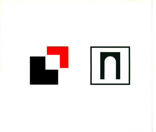
Dass es zum Konzept von KONSORTIUM gehört, ihre künstlerischen Bezugspunkte offenzulegen, zeigt sich prototypisch anhand einer Installation für das Foyer des Wilhelm-Hack- Museums.
Als Hommage an die bedeutende Sammlung russischer Avantgardekunst des Hauses haben die Künstler einen weißen Holzkubus entworfen, dessen Außenflächen zum Bildträger für ihre Auseinandersetzung mit einem Entwurf von Warwara Stepanowa (1894–1958) werden. In ihre aus einem mehrstrahligen Stern auf rosafarbener Kreisform und schwarzem Grund bestehende abstrakte Bildsprache integrierte die Künstlerin um 1919 typografi sche Elemente, die in russischer Sprache die Losung „Studiere das Alte, aber erschaffe das Neue” wiedergeben.
Während die kleinformatige Papierarbeit als Reproduktion auf einer Seite des Kubus angebracht ist, wurden die drei verbleibenden Seiten von jeweils einem der Künstler gestaltet. Jeder von ihnen isolierte ein Element des Entwurfs: Guido Münch, für dessen gesamtes malerisches OEuvre eine stark reduzierte Formensprache charakteristisch ist, die bevorzugt grafi sche Embleme des Corporate Designs adaptiert, fand seine künstlerische Umsetzung in der reduzierten Übernahme des rosa Kreises auf schwarzem Rechteck wieder. Lars Breuer fühlte sich von der Sternenform besonders angesprochen, da er dieses Motiv bereits bei Giacomo Balla für sich entdeckt und in zahlreichen Variationen künstlerisch erkundet hat.
Sebastian Freytag, der häufig mit der Verbindung aus Bild und Schrift als Bedeutungsträger operiert, konzentrierte sich ausschließlich auf Stepanowas Parole und gibt diese in einer weißen, normierten DIN-Schrift in englischer Sprache auf schwarzem Grund wieder, wobei die genormte Typografie Assoziationen an die Wandaufschriften von Lawrence Weiner aufscheinen lässt. Die Isolierung und Übertragung der abstrakten Formen und Worte und ihre Vergrößerung auf ein Vielfaches der Vorlage sowie die Verwendung des schwarzen Bildgrunds verleihen den einzelnen Bildern eine außergewöhnliche Präsenz und damit eine eigenständige ästhetische Qualität.
Die Künstler haben Stepanowas Credo, Altes zu studieren, daraus aber Neues zu schaffen, zu ihrem eigenen gemacht und führen in der Verbildlichung desselben ihre zentrale Arbeitsweise vor.
„Wir nehmen uns die Kunst, die wir brauchen.”
In der Rudolf-Scharpf-Galerie bespielten die Künstler die beiden Ausstellungsebenen und die Innenwand des Hofdurchgangs. Die Auseinandersetzung mit Architektur, Raum und funktionalen Gegebenheiten ist integraler Bestandteil und Voraussetzung für die in situ entwickelten Arbeiten.
Sebastian Freytag konstituierte die komplette Wandfl äche im Hofdurchgang der Rudolf-Scharpf-Galerie mit minimalistischen Gestaltungsmitteln zum Bildträger. Die in Blau gestrichene Wand wird optisch von dem Wort ‚Raubkopie’, das in weißen Versalien auf einer schwarzen rechteckigen Fläche zu lesen ist, dominiert. Horizontal und vertikal zur Schrift angeordnete Leuchtstoffröhren fl ankieren die schwarze Fläche. Das kalte Weißlicht der Leuchtstoffröhren, eigentlich Markenzeichen der Kunst von Dan Flavin, korrespondiert mit dem Weiß des Wortes ‚Raubkopie’ und stellt somit eine direkte Beziehung zwischen abstrakter Form und der Wortbedeutung, zwischen künstlerischem Zitat und dessen Aneignung her.
Arbeitsweisen oder ganze Kompositionen anderer zu zitieren, daraus zu lernen oder für das eigene Werk zu verwenden, konfrontiert viele Künstler mit der Problematik des Plagiats, in verschärfter Form der Raubkopie. In den 1970er Jahren wurde der Vorgang des detailgenauen Kopierens unter der Bezeichnung ‚Appropriation Art’ sogar zu einer eigenen Kunstform erhoben.
Einem konzeptionellen Ansatz folgend, wird der Akt des Kopierens und das Resultat hierbei selbst als Kunst verstanden, welche die herkömmlichen Kategorien des Kunstverständnisses wie Autorschaft und Originalität hinterfragt und darüber hinaus je nach Ansatz vielschichtige Diskurse kunsttheoretischer oder politischer Art auslöst.
Freytag stellt den Begriff der ‚Raubkopie’ bewusst dem Ausstellungstitel Mastercopy gegenüber. Die meist positive Konnotation der Meisterkopie, die in der frühneuzeitlichen Kunstgeschichte oftmals den Vorgang des Kopierens und Nacheiferns eines verehrten künstlerischen Vorbildes umfasst, verkehrt sich im Digitalzeitalter zu einem kriminellen Akt. Obgleich das Original unangetastet bleibt, wird der Vorgang des Kopierens einem Raub gleichgesetzt. Freytag, der sich in seinem Werk häufi g auf Vorlagen beruft, die direkte Kopie als künstlerische Strategie unter anderem in einer Werkreihe von Offsetdrucken verwendet, spitzt somit auch für den Betrachter eine Fragestellung visuell zu, die zwischen positiver Meister- und negativ besetzter Raubkopie oszilliert.
Eine ähnliche Strategie verfolgt Guido Münch. Die Bezugspunkte seiner Gemälde sind Industriedesigns, grafi sche Signets aus dem Alltag oder Images der Popkultur. Er ahmt sie nach und befreit sie von ihrer Nützlichkeit, indem er sie zum zeichenhaften Bild vergrößert oder – wie mit dem Düsseldorfer Bewerbungssignet für die Olympischen Sommerspiele (2012) geschehen – in einer riesigen Farbfeldmalerei à la Barnett Newman umsetzt.
Auf den beiden Wandarbeiten in der ersten Etage der Rudolf- Scharpf-Galerie prallen wie bei einer Versuchsanordnung Bild, Farbe und Schrift aufeinander. So fragt man sich auf den ersten Blick, was die Kopie eines weißen Kraken, eines Gemäldes mit quadratischen Farbfeldern sowie der in weißen Versalien direkt auf die silbergraue Wand gemalte Begriff ‚Lebensform’ miteinander zu tun haben? Ebenso offen interpretierbar erscheint auf der gegenüberliegenden Seite die Kopie des schwarzen Helmes von Darth Vader, ein weiteres um zwei Farbfeldreihen ergänztes Gemälde, dem sich in schwarzen Versalien der Begriff ‚Weltbild’ anschließt.
Die Arbeiten haben einen gewissermaßen auffordernden Charakter, die disparaten Dinge miteinander in Beziehung zu setzen, und lösen bei jedem Betrachter andere Assoziationsketten aus. Die Begriffe ‚Lebensform’ und ‚Weltbild’ sind für unsere Zeit kennzeichnend und begegnen dem aufmerksamen Betrachter täglich in den Medien. Neben diesem Alltagsbezug und seiner Verknüpfung mit dem ästhetischen Kontext ist der Rekurs auf Ludwig Wittgenstein nicht zu übersehen. Münch verwendet universale Begriffe, die einen ‚Welterklärungsanspruch’ suggerieren, deren Einbettung in den bildlichen Kontext jedoch nicht selbsterklärend ist. Die Verbindung zwischen den einzelnen Bildelementen löst sich nicht in einem spontanen Erkenntnisprozess auf, soll den Betrachter dagegen irritieren und konfrontieren.
So lassen sich die abstrakten Muster, die an streng konstruierte Bilder von Richard Paul Lohse erinnern, erst auf den zweiten Blick als Passermarken identifi zieren, die auf Industrieverpackungen zur Überprüfung der Passgenauigkeit der einzelnen Farben im Zusammendruck verwendet werden. (Abb. 9). Der Künstler verbindet diese konstruktiv-konkrete Klarheit mit der Komplexität der wirklichen und erdachten Lebensform sowie der abstrakten Begriffl ichkeit. Das abstrakte Gemälde als verbindendes Glied zwischen Bild und Schrift kann somit als Sinnbild für den Prozess der Überprüfung, des gedanklichen Abgleichs der Übereinstimmung zwischen Bild und Wortbedeutung gesehen werden.
In der zweiten Etage der Rudolf-Scharpf-Galerie scheinen sowohl das Triptychon von Lars Breuer vor der Fensterfront des Raumes als auch die Arbeiten von Sebastian Freytag den Raum nach außen hermetisch zu schließen. Auf den beiden Schmalseiten des Raumes befestigte Sebastian Freytag in fünf übereinanderliegenden Reihen gerahmte Offsetdrucke, die in ihrer Struktur an massive Marmorblöcke erinnern. Durch die fragmentarische Anordnung der Blöcke wird die Erwartung des Betrachters an eine klassische Komposition unterlaufen. Die reproduzierbaren Drucke werden nicht wie andere Arbeiten Freytags als flächendeckendes serielles Muster an der Wand verwendet, sondern einzeln gerahmt angeordnet. Sie konterkarieren die Vorstellung von Rahmen und einzigartigem Bild und werden zum Form- bzw. Gestaltungselement, das Flächen konturiert voneinander abgrenzt und zugleich ‚verfugt’.
Lars Breuer hingegen übermalt auf der mittleren Tafel des Triptychons Kapitell – Zim Zum ein korinthisches Kapitell mit fünf horizontal verlaufenden Strahlenformen, die in ihrer spitzen Gestalt an die Sternenstrahlen von Stepanowas „Studiere das Alte, aber erschaffe das Neue” erinnern. Unterbrochen von den weißen Flächen der Fensterfrontpfeiler wird der Verlauf der Strahlenformen auf den Seitentafeln wieder aufgenommen. Das korinthische Kapitell, dessen Akanthusblattwerk in Teilen unter der Übermalung zu erkennen ist, wirkt in Dreiviertelansicht und in leichter Untersicht monumental, distanziert und pathetisch. Verstärkt wird diese Wirkung durch das große Bildformat, die dynamische Übermalung und die Verwendung des zur ‚Würdeformel’ gewordenen Triptychons. Keine ‚inneren Kraftlinien’ wie im Futurismus, sondern von außen überlagernde wuchtige Kraftstrahlen und harte Schwarz- und Graukontraste rhythmisieren und dynamisieren das Bild. Der Titel der Arbeit bezieht sich auf Barnett Newmans 1969 entworfene Skulptur Zim Zum I, die aus zwei als Zickzack geformten Stahlwänden besteht, die – einander gegenüberstehend – einen Korridor bilden. Schiebt man die beiden Wände dicht zusammen, ergeben sich drei Kuben als Hohlformen. Diese dreiteilige, vielschichtige Struktur des Zim Zum I überträgt Breuer in das zweidimensionale Bild.
Seine Reminiszenz an Newmans Metallskulptur bekräftigt er zudem mithilfe der grauen matten Rostschutzfarbe, die er für die Strahlenformen verwendet.
Der Begriff ‚Zimzum’ geht auf einen Schöpfungsmythos aus der kabbalistischen Lehre des Rabbi Isaac Luria Ashkenasi (1534 bis ca. 1572) zurück und bedeutet ‚Konzentration’ oder ‚Kontraktion’. Er bezeichnet ein Vakuum in Form eines gewaltigen, leeren Raumes, das zu Beginn des Schöpfungsereignisses entstanden sein soll, nachdem das unendliche Licht sich in sich selbst zusammenzog. Barnett Newmans Skulptur Zim Zum I konfrontiert den Betrachter durch die reale Erfahrung des Durchschreitens mit seiner eigenen physischen Begrenztheit und lässt ihn diese künstlerische Arbeit als Tür zu einer inneren Erfahrung begreifen. Lars Breuer hingegen lädt seine Arbeit über formale Anklänge bei Barnett Newman und dessen okkulte Anspielungen im Titel sowie die Verwendung einer zur Pathosformel reduzierten architektonischen Form und einen ebensolchen Bildtypus inhaltlich vielschichtig und kontrovers auf.
So revidiert sich der erste Eindruck der hermetisch räumlichen Geschlossenheit bei genauerer Betrachtung allmählich. Beide künstlerische Positionen zitieren und thematisieren architektonische Formeln sowohl als vermeintliches Blendmauerwerk eines pseudoarchitektonischen Eingriffs in die Raumstruktur, das Massivität aus wertigem Material vortäuscht, als auch als zur dynamischen Pathosformel reduziertes korinthisches Kapitell. Gemeinsam ist beiden eine gewisse Fragilität, Durchlässigkeit und Offenheit, die eine kontroverse Auseinandersetzung mit den Formen innerhalb der Werke, aber auch mit dem Ausstellungsraum evozieren.
Der ausgeprägt konzeptuelle und strategische Umgang mit Zitaten aus Kunstgeschichte und Kunsttheorie wird in der gemeinsamen Wandcollage, die beide Stockwerke der Rudolf- Scharpf-Galerie verbindet, deutlich: Wie eine ‚best book list’ geben die Kopien der Bucheinbände Auskunft über die Literatur, die das Denken der Künstler und ihren Blick auf die Welt und die Kunst maßgeblich beeinfl usst hat. Von Francesco Petrarca über Martin Heidegger bis Heinrich Dunst – man könnte die Collage als ein inhaltliches und formales Puzzle bezeichnen, in dem Ideologien und Weltbilder kollidieren.
Auch in ihrem Vortrag mit dem Titel Wir Replikanten im Zentrum für Kunst und Medientechnologie Karlsruhe (ZKM) am 24.7.2008 zitierten die KONSORTIUM-Künstler eine gezielte Auswahl von Defi nitionen und Statements, die den Umgang mit der Tradition und mit Vorbildern innerhalb der Kunstgeschichte betreffen. Hierzu gehörten Beiträge von Arthur C. Danto, Oskar Bätschmann, Thomas McEvilley sowie Samuel Beckett, die offenlegen sollten, aus welchem Gedankengut ihr künstlerisches Selbstverständnis hervorgeht. Diesen Zitaten stellten die Künstler eigene Aussagen gegenüber:
„Die Vergangenheit ist unsere Heldengeschichte. Unser Götterhimmel ist unser Himmel! Wir nehmen uns die Kunst, die wir brauchen. […] Die Utopien der Moderne sind unsere Leitmotive, jede für sich eine Waffe unseres Hasses. […] Wir wählen und bauen unsere eigene Genealogie.”
Ihre Statements haben Manifestcharakter und offenbaren eine leidenschaftliche und kontroverse Auseinandersetzung mit der Tradition. In der künstlerischen Praxis schließlich zeichnen das Entkernen und Vereinfachen, das Reduzieren und Kondensieren von Vorbildern auf ihr konstruktives Gerüst, ihre Matrix, ihre radikale, kompromisslose Haltung aus. Ihre spezielle individuelle Form der Aneignung und Anverwandlung von ‚high and low’ ist es, die zur ‚Mastercopy’ führt und jede der Positionen im KONSORTIUM abgrenzt.
Theresia Kiefer, Ludwigshafen am Rhein 2009 -
Theresia Kiefer engl.
“Study the old, but create the new”
Strategies of Appropriation and Citation in the works of Lars Breuer, Sebastian Freytag and Guido Münch
Swearing something akin to an oath of allegiance back in 2004, four former students of the Düsseldorf Academy – Lars Breuer, Sebastian Freytag, Guido Münch, and, at that point in time, Jan Kämmerling – joined forces to establish a new artists’ association. Called KONSORTIUM, their collaboration was linked to a non-commercial exhibition space.
In a bid to strengthen their ties, the ‘consorts’ looked to Jacques- Louis David’s famous painting The Oath of the Horatii as a model for their union and subsequently re-enacted the painting’s principal motif for a photograph taken a year later. When it comes to the depiction of common interests and aims, seldom has a modern association of artists opted for a miseen- scène quite as dramatised as this. Redolent of late eighteenth- century historical painting, the overall image the group presents comes across as being strangely wooden, if not actually anaemic.
Indeed, coupled with the sober setting and the backdrop of a bare white wall, the actors’ plain, uniform clothing and the wooden poles and cardboard rolls they hold in place of spears and lances combine to make the photograph a rather pale imitation of the pathos-laden original.
Thereafter, the adoption of poses – or, fi guratively speaking, of postures – directly citing historical gestures became a recurring principle of their self-portrayal.
Whether we consider their re-enactment of a 1969 group photo featuring American conceptual artists Robert Barry, Douglas Huebler, Joseph Kosuth and Lawrence Weiner, or of record covers put out by the Düsseldorf-based bands “Kraftwerk” and “Die Krupps”, the works have one thing in common: they each copy their respective historical sources while at the same Stetime contesting both their meaning and its signifi cance for the group’s overall artistic practice. While the photographs might be regarded as the group’s calling card, as it were, or as a kind of all-encompassing mise-en-scène, they also raise questions – as heralded by the exhibition title – as to the importance of the act of citation for both the individual KONSORTIUM members and their work.
Bearing in mind that exhibition-goers are unlikely to have any precise notion of what is behind the term ‘Mastercopy’, the title of the show might initially seem a little confusing. Is it about a ‘master copy’ – in other words, a one-to-one duplication or forgery of a major artwork? Does the inherent ambiguity of the term refer to both the copy and the original masterpiece? Or might it even have something to do with the eponymous computer programme developed in the 1980s to enable the copying of data and facts? And what is actually being copied here? Is it an artistic style or just pure information? Artistic concepts or personal attitudes?
At the core of the exhibitions mounted by the Rudolf-Scharpf- Galerie and the Wilhelm-Hack-Museum, these key questions can be examined in the context of various individual pieces and one collaborative installation.
“Study the old, but create the new”
The fact that the disclosure of their references constitutes an integral part of KONSORTIUM’s conceptual paradigm is prototypically evident in the installation produced for the foyer of the Wilhelm-Hack-Museum.
It was here that, as a tribute to the museum’s eminent collection of works by the Russian avant-garde, the artists designed a white wooden cube, the surface of which they used as a image carrier for their artistic enquiry into a graphic design produced by Varvara Stepanova (1894–1958) around 1919. She integrated typographical elements into the abstract image of a multi-pointed star on a pink-coloured circle on a black background. These were used by the artist to form the slogan “study the old, but create the new” written in Russian.
Whereas a reproduction of the small-format work on paper was mounted on one side of the cube, each of the artists had free reign over one of the remaining sides. All three elected to focus on a different element of Stepanova’s design. Guido Münch, who paints with an extremely reduced formal vocabulary and often adapts graphic emblems from the realm of corporate design, singled out the pink circle on the black rectangle and reproduced it in a reduced form. Lars Breuer felt especially drawn to the star shape, having already come across a similar motif in the work of Giacomo Balla and explored it in manifold variations.
Sebastian Freytag, who frequently uses a combination of pictures and writing that acts as a signifier, turned his attention to Stepanova’s slogan. He reproduced the words in English, opting for a standard white typeface on a black background. The standardised typography here recalls Lawrence Weiner’s wall installations. The isolation and transfer of abstract shapes and words, their enlargement to a size many times that of the original and the effect of the black background combine to lend each picture an extraordinary presence and hence an aesthetic quality in its own right.
The artists are thereby adopting Stepanova’s edict to study the old but to create something new in the process, and, by literally illustrating it, allowing an insight into their own creative methods.
“We claim the art we need”
For the exhibition at the Rudolf-Scharpf-Galerie, the artists installed works on both levels of the gallery as well as on the interior wall of the passage leading through to the courtyard. An integral component – indeed, a prerequisite – of their in situ pieces is their interaction with the architecture, the space and its functional demands.
Deploying only very minimalist design techniques, Sebastian Freytag transformed the entire surface of the passageway into an image carrier. The wall, which is painted blue, is dominated by the word ‘Raubkopie’, which means ‘pirate copy’. The word is spelt out in white capital letters across a black rectangular area. This black area is fl anked by horizontal and vertical fluorescent tubes arranged into script. The cold white light of the fluorescent tubes – the trademark signature of Dan Flavin’s oeuvre – corresponds to the whiteness of the word ‘Raubkopie’, thereby establishing a direct relationship between abstract form and semantics, between an artistic reference or citation and its appropriation.
The tendency of many artists to reference, learn from or incorporate the creative methods, techniques, and sometimes even entire compositions of others can bring them face to face with the problem of plagiarism, or in its more serious form, piracy. During the 1970s, the act of copying an artwork one to one even became an art form in its own right, which traded under the name of ‘Appropriation Art’.
In the context of conceptual art, both the act of copying a work and the ensuing product are regarded as art. As a result, the conventional categories that would otherwise inform our understanding of art – categories such as authorship and originality, for example – are called into question. And, depending on the approach, this can spark off all manner of complex discussions, whether of an art-theoretical or political nature.
Freytag consciously juxtaposes the term ‘pirate copy’ with the exhibition title Mastercopy. The erstwhile positive connotations of the master copy, which in early modern art history was largely associated with the attempts of aspiring artists to achieve greatness by copying the masters, have been overshadowed in the digital age by connotations of a criminal kind. Though the original might well remain unscathed, the very act of copying has come to be equated with theft. Against the backdrop of his frequent referencing of historical sources and use of the direct copy as an artistic strategy – as exemplifi ed by his series of offset prints – Freytag thus lends a visual pertinence to the tension between the master copy with its positive connotations and its negative counterpart, the pirate copy.
Guido Münch pursues a similar strategy. His paintings take industrial design, everyday logos and images from popular culture as their reference points. He imitates them and frees them from their utilitarian nature by enlarging them so much that they become symbolic. As is the case with the logo designed for Düsseldorf’s bid for the 2012 Summer Olympics, what emerges is a vast colour-field painting in the tradition of Barnett Newman.
On both of the wall pieces installed on the first floor of the Rudolf-Scharpf-Galerie, there is a collision of image, colour and script resembling a scientifi c experiment. One cannot help but wonder at fi rst glance what the copies of a white octopus, a painting with square colour fi elds and the word ‘Lebensform’ (way of life), which is painted directly onto the silver-grey wall in white block letters, might have to do with one another. Equally open when it comes to potential interpretations is the copy of Darth Vader’s black helmet emblazoned on the opposite wall, another painting expanded by two rows of colour fields adjoined by the term ‘Weltbild’ (world view) painted in black capital letters.
Inspiring different chains of association in each viewer, the works are quite demanding in a certain sense, calling upon us to set the disparate elements in relation to one another. Both ‘way of life’ and ‘world view’ are terms characteristic of our time; the attentive viewer is likely to encounter them on a daily basis in the media. Yet beyond the reference to everyday life and its nexus with the aesthetic context, there is an unmistakable reference to Ludwig Wittgenstein. Münch opts for universal terms in his art, for words that smack of a certain pretension to being able to ‘explain the world’ in some way – although their integration within a visual context seems to be far from selfexplanatory. The link between the various pictorial elements does not dissolve within a spontaneous cognitive process; rather it is meant to unsettle and confront the viewer.
Indeed, it is only at second glance that the abstract patterns – reminiscent of Richard Paul Lohse’s tightly constructed pictures – can be identifi ed as plot markers, a feature of industrial packaging designed to check the accuracy of the fit of individual colours in combined printing. The artist associates this constructive-concrete clarity with the complexity of real and made-up ways of life on the one hand, and with abstract concepts on the other. Abstract painting as a link between image and script can thus be viewed as a symbol of the process of verifi cation, the mental review of the congruence of the picture and the meaning of the word.
On the second floor of the Rudolf-Scharpf-Galerie, the triptych by Lars Breuer in front of the windows and the works by Sebastian Freytag both seem to hermetically seal the space off from the outside world. Freytag mounted fi ve rows of framed offset prints, one above the other, in a structure that reminds one of solid blocks of marble. The fragmentary arrangement of the blocks undermines our expectations of a classical composition. Contrary to his other works, this time Freytag did notuse the reproducible prints to create a serial, all-over pattern on the wall, but rather arranged them as discrete units in individual frames. Challenging the very concept of framing with its premise of the uniqueness of a particular image, the prints, in their reproducibility, become an element of form or design serving to distinguish, and at the same time join, different areas of space.
Taking a different approach in his work, Lars Breuer painted fi ve horizontal rays over the top of the Corinthian capital depicted on the middle panel of his triptych Kapitell – Zim Zum; their points recall the rays of the star in Stepanova’s “Study the old, but create the new”. Interrupted by the white surface of the window columns, the fl ow of the rays is continued on the side panels. When viewed from a three-quarter position or slightly from below, the Corinthian capital, the acanthus leaf-work of which is partially discernible beneath the over-painted layer, seems monumental, distanced and dramatic. This effect is underscored by the large format of the picture, the dynamic overpainting and the use of the ‘dignity formula’ that the triptych has come to embody. The image itself is infused with rhythm and dynamism stemming not from any ‘inner lines of force’, as is the case with Futurism, but from massive rays of force applied from the outside and from the harsh black and grey contrasts. Breuer’s title refers to Barnett Newman’s sculpture Zim Zum I. Dating from 1969, the work takes the form of a corridor composed of two zigzagging steel walls. Were they to be pushed together, the two walls would take the form of three hollow cubes. For his triptych, Breuer translated this three-part, multi-layered structure into a two-dimensional picture. The matt-grey anti-rust paint that he used for the rays further reinforces his invocation of Newman’s metal sculpture.
‘Zimzum’ is a term used in the cabbalistic teachings of Rabbi Isaac Luria Ashkenazi (1534 – ca. 1572) to signify ‘concentration’ or ‘contraction’. In Luria’s creation myth, it denotes a vacuum, a vast empty space believed to have come into being once the infi nite light had contracted and receded into itself at the beginning of creation. As a result of the very real corporeal experience of passing through the zigzag corridor, Barnett Newman’s sculpture Zim Zum I confronts viewers with their physical limitations, so that the work might be regarded as something of a doorway to inner experience. Lars Breuer, on the other hand, combines references to Barnett Newman’s formal vocabulary and occult allusions in the title and the incorporation of architectural and pictorial forms both now reduced to mere ‘emotive themes’ to make his work both complex and controversial.
On closer inspection, then, the initial impression of a hermetically sealed spatial entity undergoes a process of gradual revision. Both artistic approaches quote and thematise architectural formulae, whether in the putative screen wall of a pseudoarchitectonic intervention simulating the solidity of high-quality building materials, or in the Corinthian capital reduced to a dynamic ‘emotive theme’. Both also share a certain fragility, permeability and openness that pave the way for a controversial interrogation of the forms represented within the works and the exhibition space as well.
The artists’ pronounced conceptual and strategic interaction with art-historical and theoretical references is clearly manifest in their collaborative wall collage linking the two storeys of the Rudolf-Scharpf-Galerie: much like a ‘best book list’, the book-cover copies that make up the collage offer an insight into the literature that has been a major infl uence on the artists’ thought and on their views of the world and of art. Ranging from Petrarch via Martin Heidegger to Heinrich Dunst, the collage might be regarded as a puzzle of content and form in which ideologies and worldviews collide.
In a lecture entitled Wir Replikanten (We Replicants), given at the Zentrum für Kunst und Medientechnologie Karlsruhe (ZKM) on 24 July 2008, the KONSORTIUM artists cited a selective pick of the defi nitions and statements that had informed their approach to tradition and their historical role models. These included contributions by Arthur C. Danto, Oskar Bätschmann, Thomas McEvilley and Samuel Beckett and were intended to shine a light on the body of thought that had both engendered and shaped their sense of artistic identity. The artists contrasted these references with their own statements:
“The past is our heroic story. The realm of the gods is our realm! We claim the art we need. […] The utopias of modernity are our leitmotifs, each in its own right a weapon of our hatred. […] We select and construct our own genealogy.”
The artists’ statements read like a manifesto, revealing a passionate and controversial interrogation of tradition. What ultimately stands out in their artistic practice is the way they gut and simplify, reduce and condense their various role models until all is laid bare – the underlying framework, the matrix and the radical, uncompromising posture. It is their own individual way of appropriating and adapting ‘high and low’ that both leads to the ‘master copy’ and distinguishes each of the positions within the KONSORTIUM.
Theresia Kiefer, Ludwigshafen / Rhine 2009